To view full magazine click here
abide. Magazine Case Study
In this project I was charged with redesigning a magazine. The publication I chose was Deeply Rooted Magazine (DRM) because I believed it had not reached its full design potential due to a few key design flaws. The publication mainly uses photographic imagery alongside its articles; however, there is always a disconnect between word and image in the stories that result in a struggle to engaging the reader. There is also issues with the typography utilized, specifically with pairing different typefaces together, contrast on photo backgrounds, and following some general type rules. Lastly, the publication lacks a certain interactivity that would easily fit within the subject matter and encourage the audience to keep the magazine as a commemorative piece.
One quality that made DRM attractive to choose was its very specific target audience of Christian women in the age range of 25–50 years old. Due to this, there is less competition than a general woman’s lifestyle magazine would have but there is also a smaller market.
Logo sketches for Deeply Rooted
My first challenge was to design a logo for Deeply Rooted that represented the true nature of the magazine. A lot of tree and root imagery came to mind but all ideas were a disconnect from the tone I wanted the magazine to embody. Therefore, I decided to rename the publication all together. I chose to name the magazine abide. due to the intentions of the writing I wanted to include and the addition of the interactive element. The name abide was directly adjacent to deeply rooted. As deeply rooted calls to remain rooted in Christ, abide calls to always abide in Christ. And due to the more metaphorical nature, abide was well suited for a typographic logo execution.
Type logo iterations exploring different type and “i” designs
To start the content of my magazine, I went through the process of establishing my grid, type choices, and folio styles first. Then, I created my table of contents. I chose articles already written by the DRM team so that my final executions could show how my photos or illustrations more accurately represented the content and connected with the reader. I also decided to utilize the three sections I divided my magazine into intentionally. The sections are reflect, motivate, and create.
Therefore, reflect had a letter from the editor, showing her reflection of the theme of the issue (to rest in the Creator) and a bible study that allowed for the readers to have their own time of self-reflection. Motivate is the section that held the two features that where encouragements to the readers on why and how to rest and also how to find joy in the Creator by creating. This feature bridges over to the section create where different artists and projects are included to display active creation in the world today.
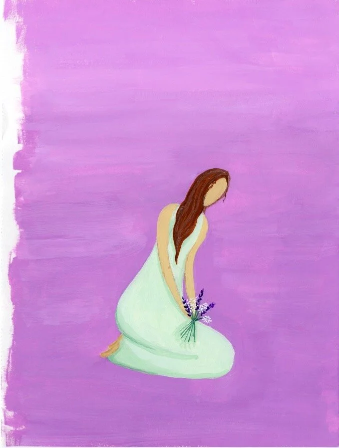
Cover sketches and final gouache painting
In the end, abide. focused on creating intentional illustrations to enhance the articles and readings chosen for the issue, customizing the typography utilized to showcase a clear hierarchy and allow for an easier reading experience, and adding elements to the publication that allow for audience interactivity such as short devotions and response areas.
By using more illustrations than photos, I made designs that are unique to the subjects discussed in the publication. Then focusing on reader interactivity allowed for each reader to have a personalized experience with the publication by being able to add themselves into the publication.

