NovelTea Packaging Case Study
As many people who know me can tell you, I really love to read. I enjoy diving headfirst into stories and collecting books to commemorate all the series that I have read and the characters I have fallen in love with throughout the years. That is where this project was inspired from. So many people love snuggling up with a book and a cup of tea. Thus, NovelTea.
NovelTea is a brand that collaborates with publishing houses to create a line of tea flavors and packaging specific to a series of books. Examples of series that could be chosen are Harry Potter, Game of Thrones, or Lord of the Rings.
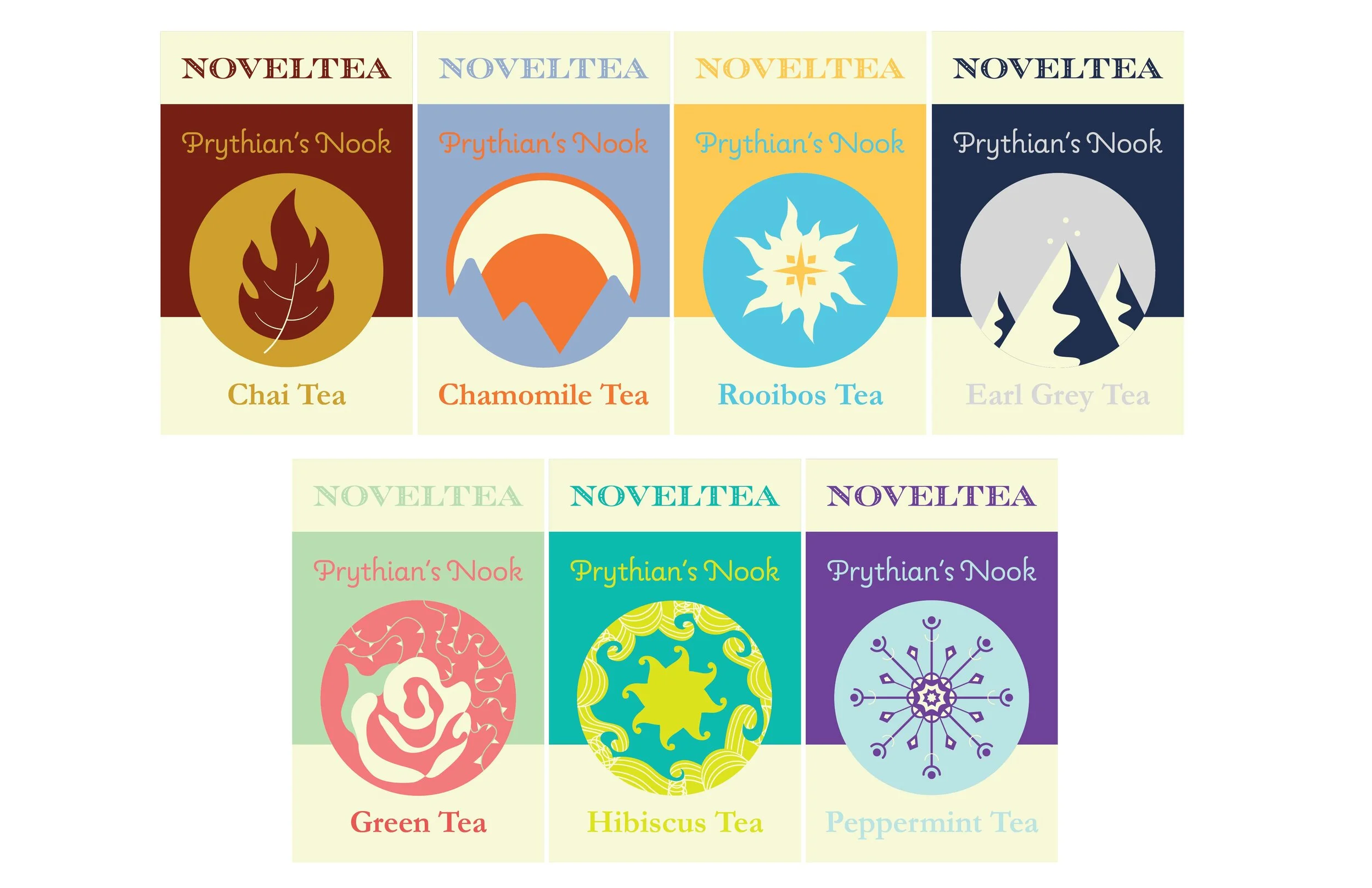
For this year’s line, the book series chosen was A Court of Thornes and Roses (ACOTAR) by Sarah J. Maas. The line includes a tea flavor for each High Court that exists in Prythian, the continent the setting of the series takes place in. This is also the reason why the line is called Prythian’s Nook. There are seven courts in total, four seasonal (Spring, Autumn, Winter, and Summer) and three solar courts (Night, Day, and Dawn)
The first step to this project was defining the target audience. ACOTAR is a young adult fiction book but it appeals to readers in their 20s as well. This opens up a large group of people that could be fans of Sarah J. Maas and her book series. This could also include readers that might not be interested in tea itself. Therefore, the commemorative nature of the packaging is also important in the execution because many readers could buy it for its ACOTAR related designs alone.
In order to decide on the design of my packaging, I did a competitive analysis of other tea brands and their packaging style. I then narrowed the styles down according to their design aesthetics and how my packaging could fit in and stand out among them. Even though the teas would be sold online and in select cafes. It needed to gain recognition among avid tea drinkers.
My analysis led me to decide that my packaging would be a box and sleeve combination. This would allow for all of the required information to be on the packaging while also leaving room for court appropriate designs that would excite fans and increase desirability.
I also was required to have additional items included with the packaging such as an informational pamphlet or brochure. I decided to have a small brochure that would showcase the entire line of teas as well as the purpose of NovelTea. Inside I also wanted to include something specific to the target audience; therefore, each box comes with a bookmark themed to the design of the court associated with the tea they purchased.
So, in my solution I designed a seal for each of the High Courts of Prythian and then fully executed the design of three of the teas: Spring, Night, and Autumn. Each separate package has a similar set up and reveal due to the sleeve, but the design is very specific to each court and follows their seal’s color palette. Commonly across all designs it a cream color that acts as a neutral hue to maintain consistency across the seven different executions.
Overall my design is unique because is essentially creates and pinpoints its own target audience with every line of tea that is executes. The success of this specific campaign was measured through a presentation to a panel of judges. The main concerns came with copyright issues but once explained that NovelTea works with the publishing companies not much feedback was given.
I learned to look more into the printing of a packaging execution early because it is essential to the end experience of your execution. I also learned to not be afraid to get very specific with your ideas and your design solution. The more specific the tighter the campaign and success should be within reach.


