Harrison’s Landing Menu Case Study
This project occurred during my Typography II course. I was required to select a restaurant to redesign the menu of, putting my newly developed typography skills to work. I chose Harrison’s Landing due to that fact that their menu’s design presented a severe disconnect from the restaurant itself and the target audience.
Harrison’s Landing is a seafood restaurant located on the t-heads by the Marina in downtown Corpus Christi, with a portion quite literally floating on the bay. Therefore, the highly colorful design with the bright hues of orange and lime green with navy blue and white did not showcase the truly relaxing environment of Harrison’s Landing.
Menu Cover Before
To see full current menu visit the Harrison’s Landing website
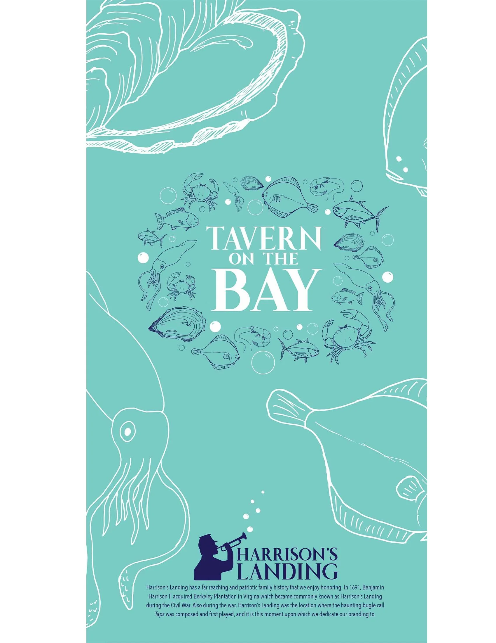
Menu Cover After
The information for the menu was also not organized in a legible fashion. There were too many boxes within sections and special menu items were circled as well. Every item competed for attention and therefore nothing stood out to gain true recognition.
I am personally familiar with the restaurant due to attending many family gatherings there and knew the true tone of Harrison’s Landing did not align with the design of its menu.
In this rebrand exploration, my goal was to create a more cohesively organized brand and menu system that represented the coastal atmosphere that Harrison’s Landing cultivated on location but lacked in ephemera. Illustration style, color palette, and type setting are what brought this rebrand to life and allowed for a successful design execution.
Current Logo
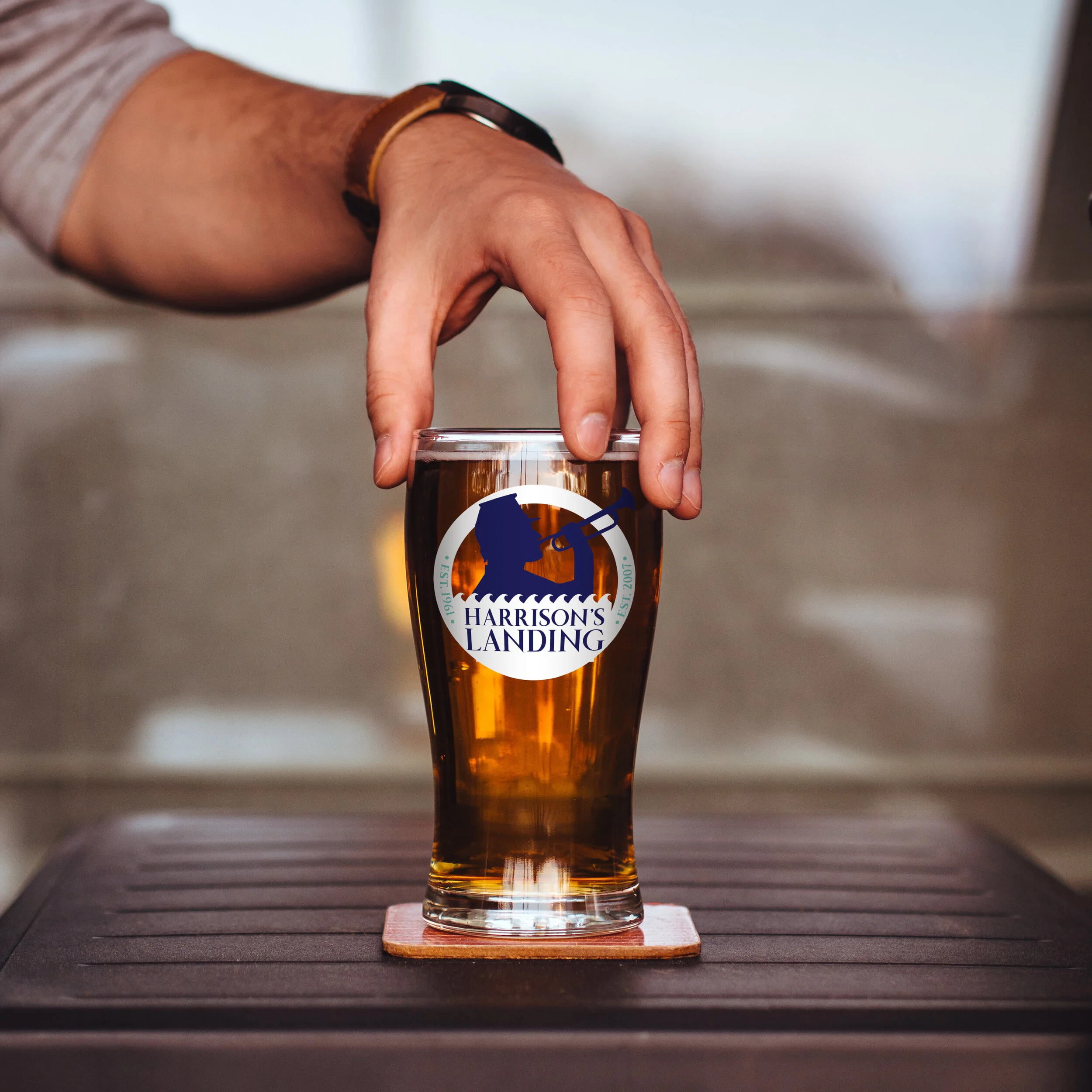
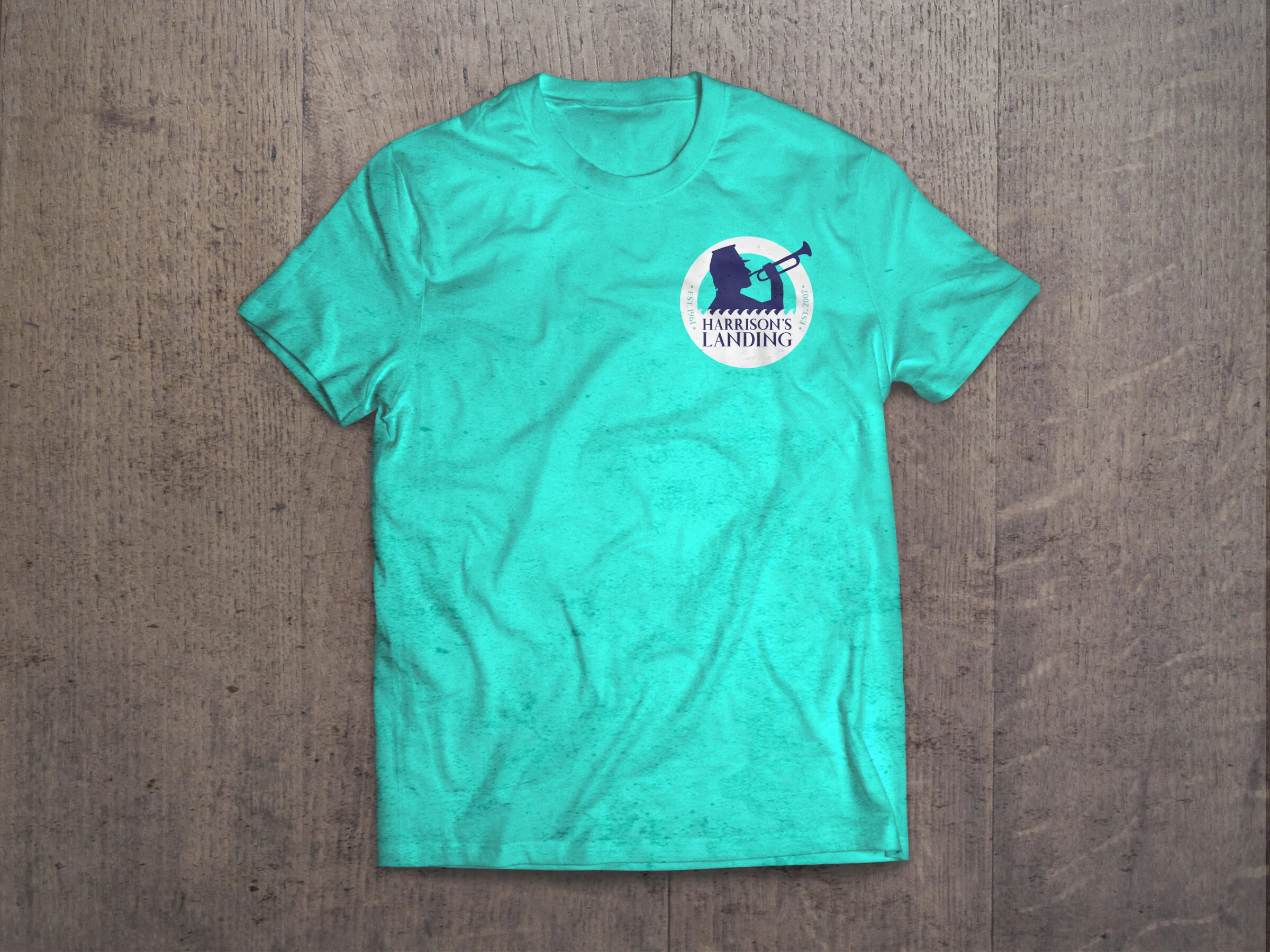
Refined Logo
I first began by cleaning up the existing logo. Both the mark and type were not clearly rendered and it was hard to discern what exactly the mark was. By making a new vector illustration it became clear that the mark was a derived from the history of Harrison’s Landing and the Harrison’s themselves.
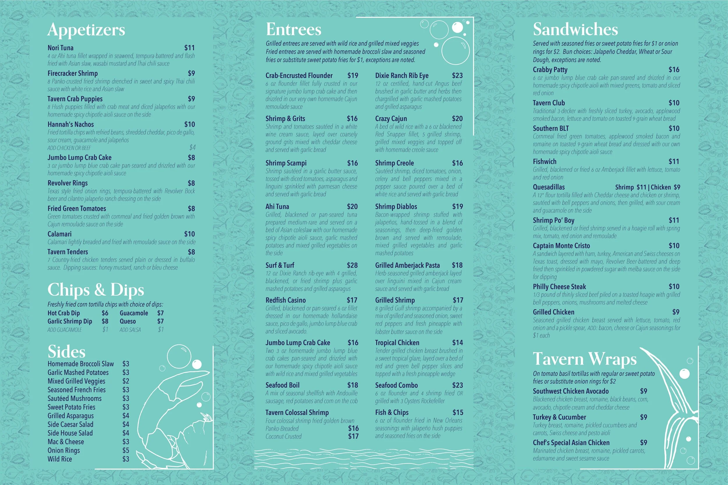
Next, I began by typing out all the content of the menu and evaluating the different categories and extra information. One area where I believed a lot of information could be cut down was with the history of Harrison’s Landing. Originally this tale was given three-quarters of the back page but from reading it, it was obvious there was too much detail and customers were sure to show very little interest in the dense copy.
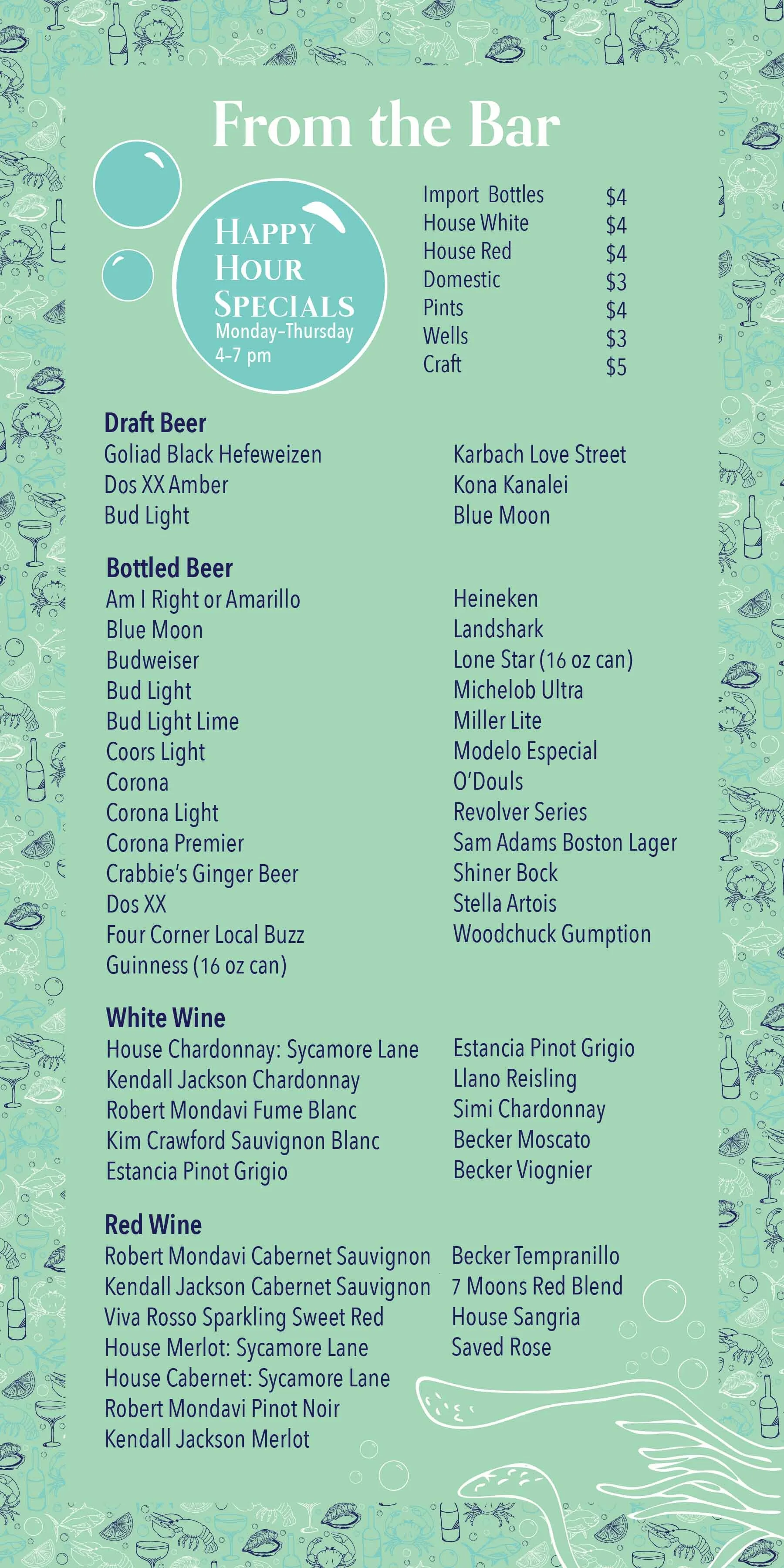
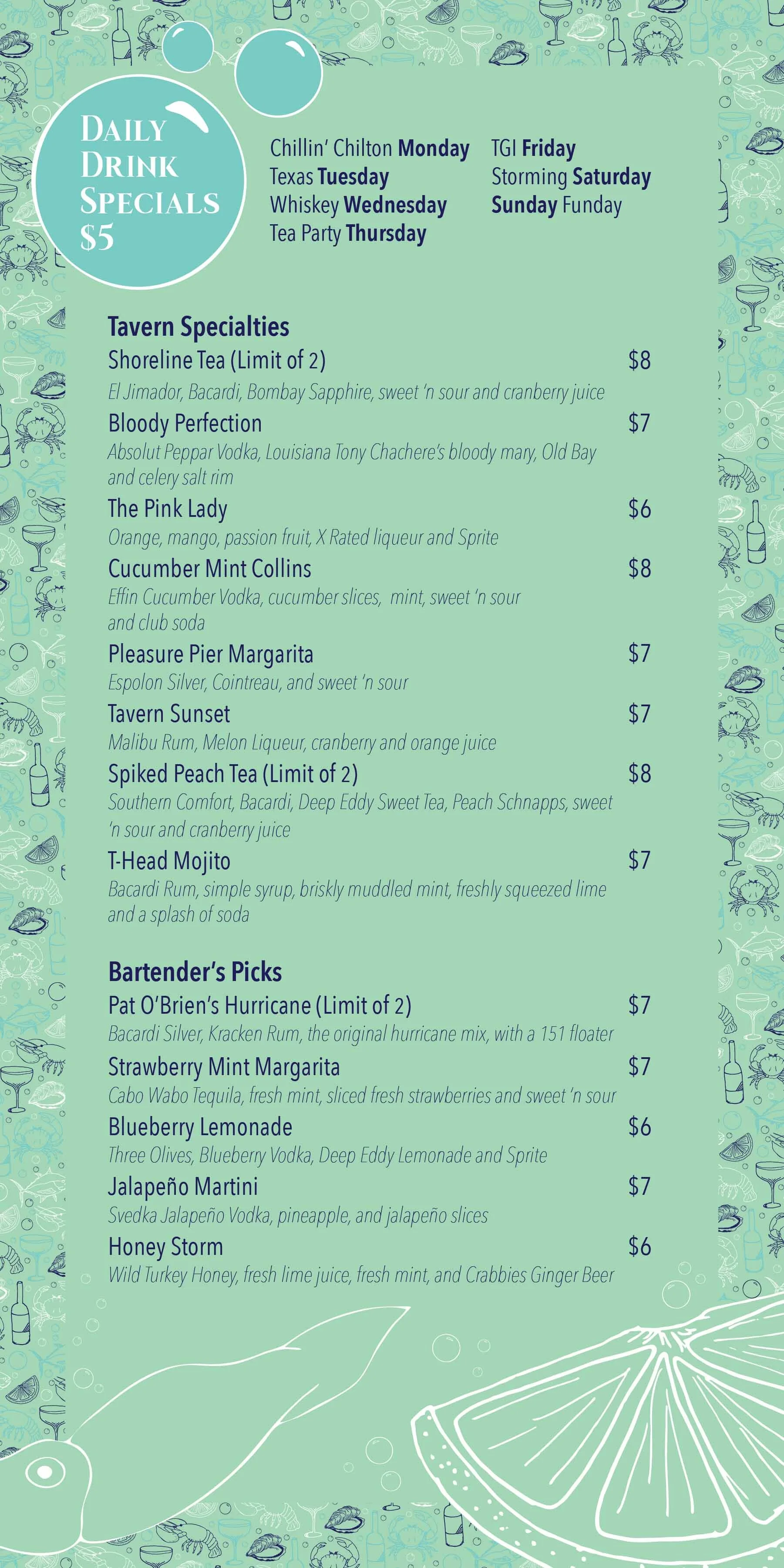
After establishing that the menu items were in a more logical organization I defined my type choices and color palette. I wanted to establish a more modern, tropical, and calming tone for the restaurant so I selected a deep blue, turquoise, and a pale sea green. Similar to the original colors (minus the orange) but treated in a more accurate way to the environment. I also used white as a pop color. My type choices were a collaboration of modern and old school by having the top hierarchy of type as serif’s with higher contrasts and a clean sans serif face for the body copy.
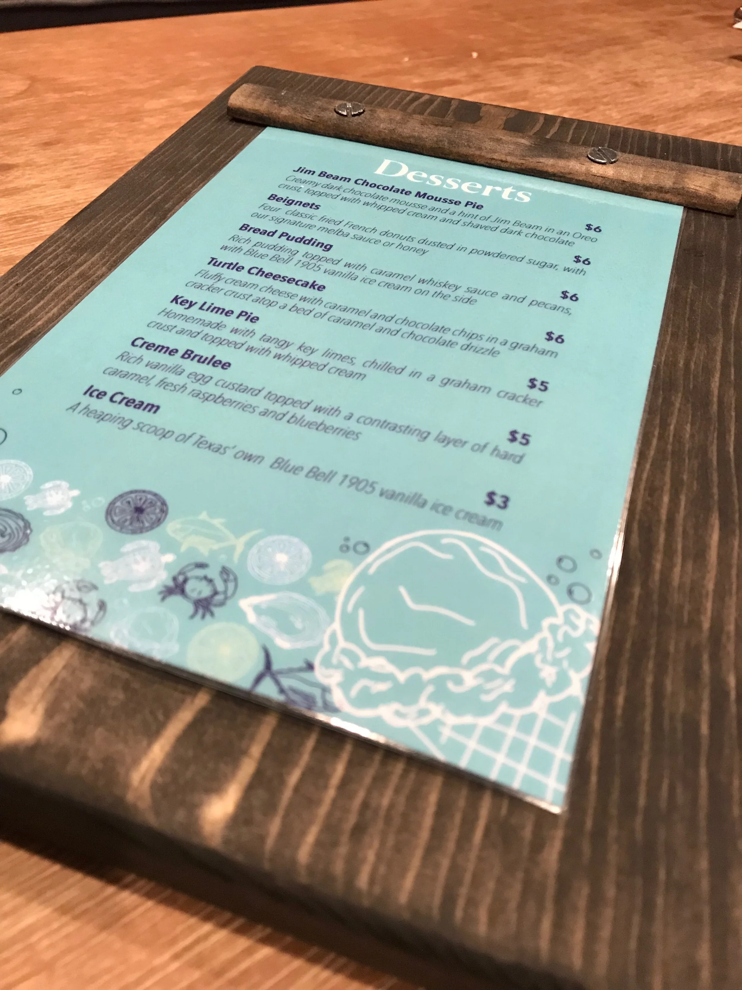
I decided for the style of my menu I wanted a trifold for the main menu, a tall thin two sided tavern menu and then the dessert menu would be smaller but presented on a wooden block to allow it to stand out from other items on the table and gain recognition from guests to want to order dessert.
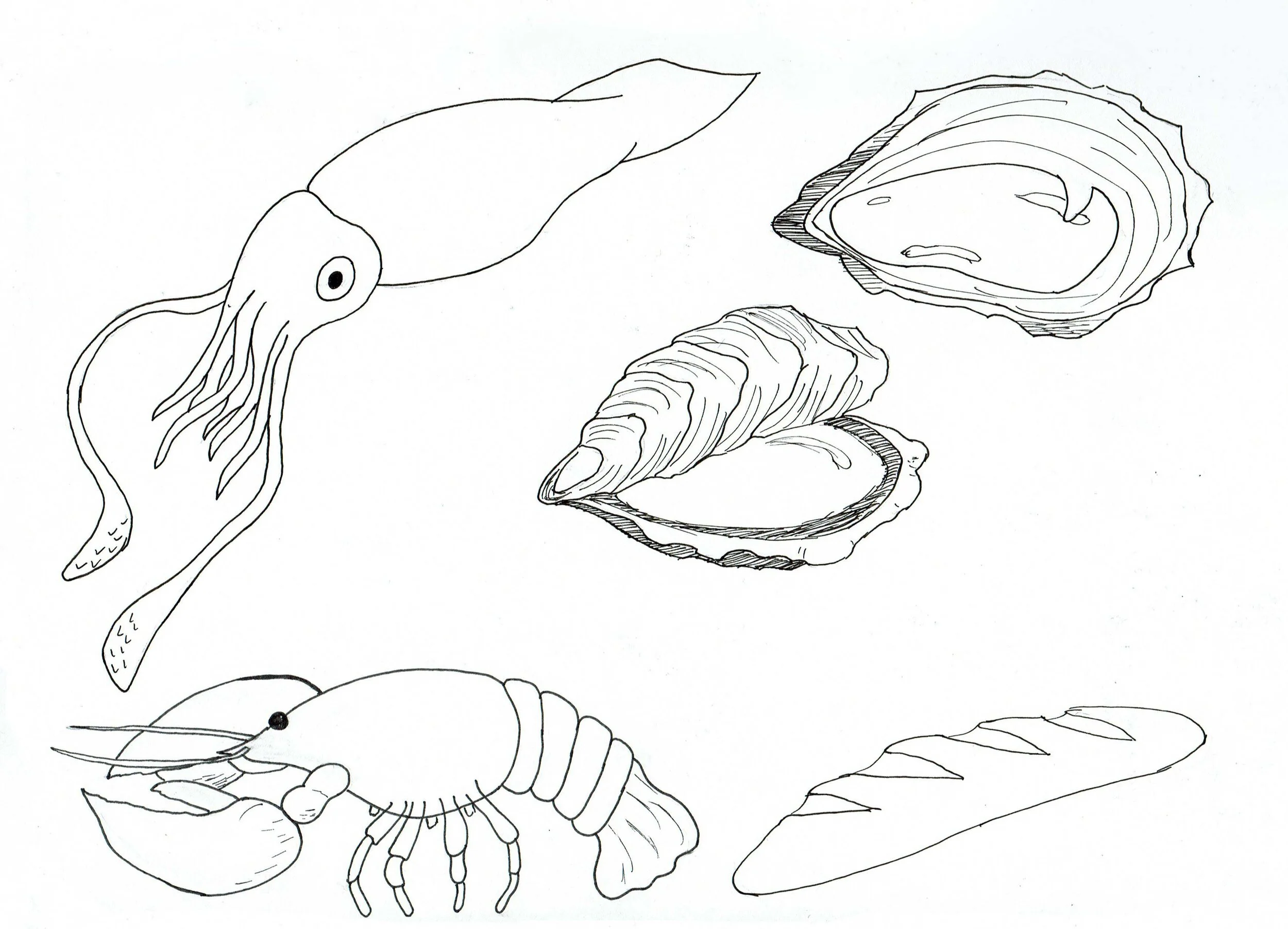
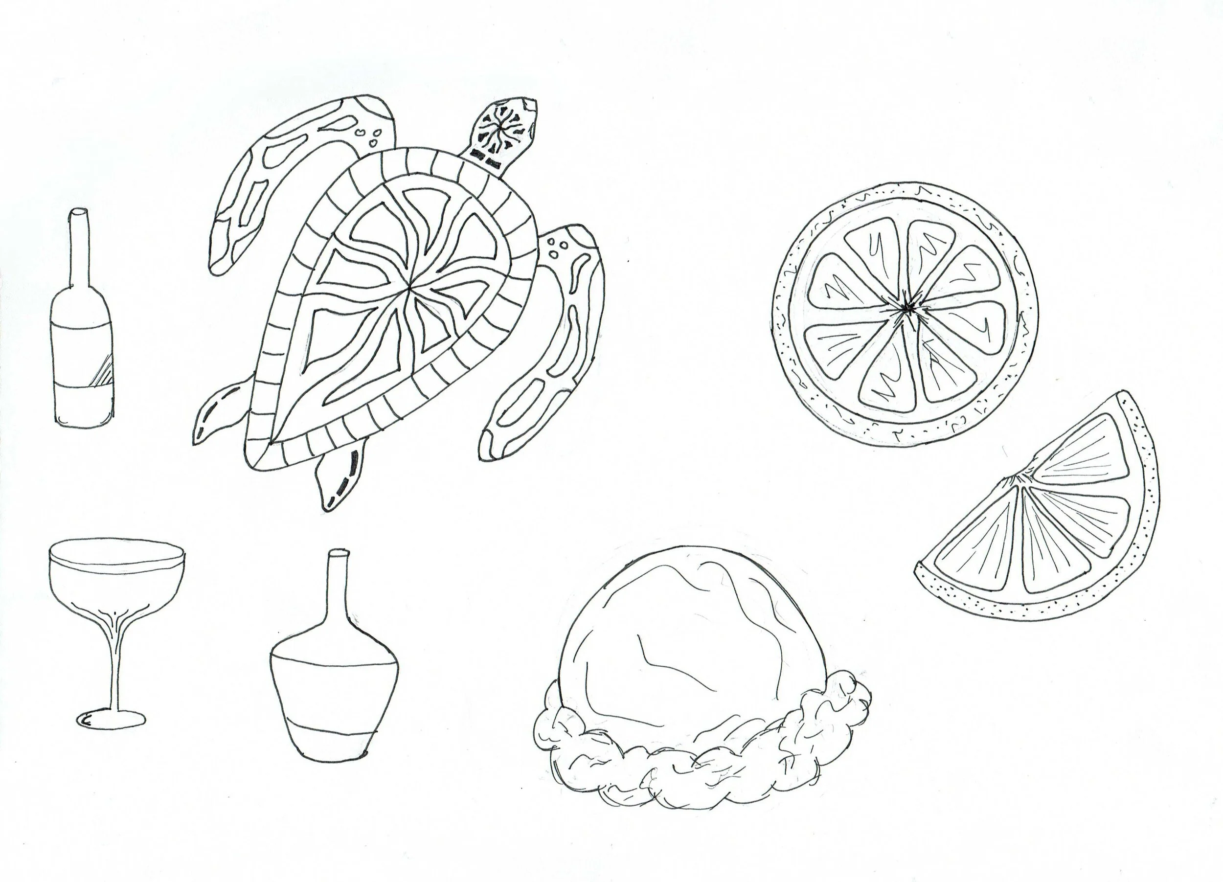
I implemented line illustrations as the main design element to introduce a touch of elegance to the restaurant’s brand. Harrison’s Landing is not an outrageously fancy seafood restaurant but it does still sit in the mid-range for price and therefore, a design that represents that allows the people dining in to understand that right away. A menu should represent every facet of the restaurant and if the menu looks cheap people would expect the food to be cheap as well.
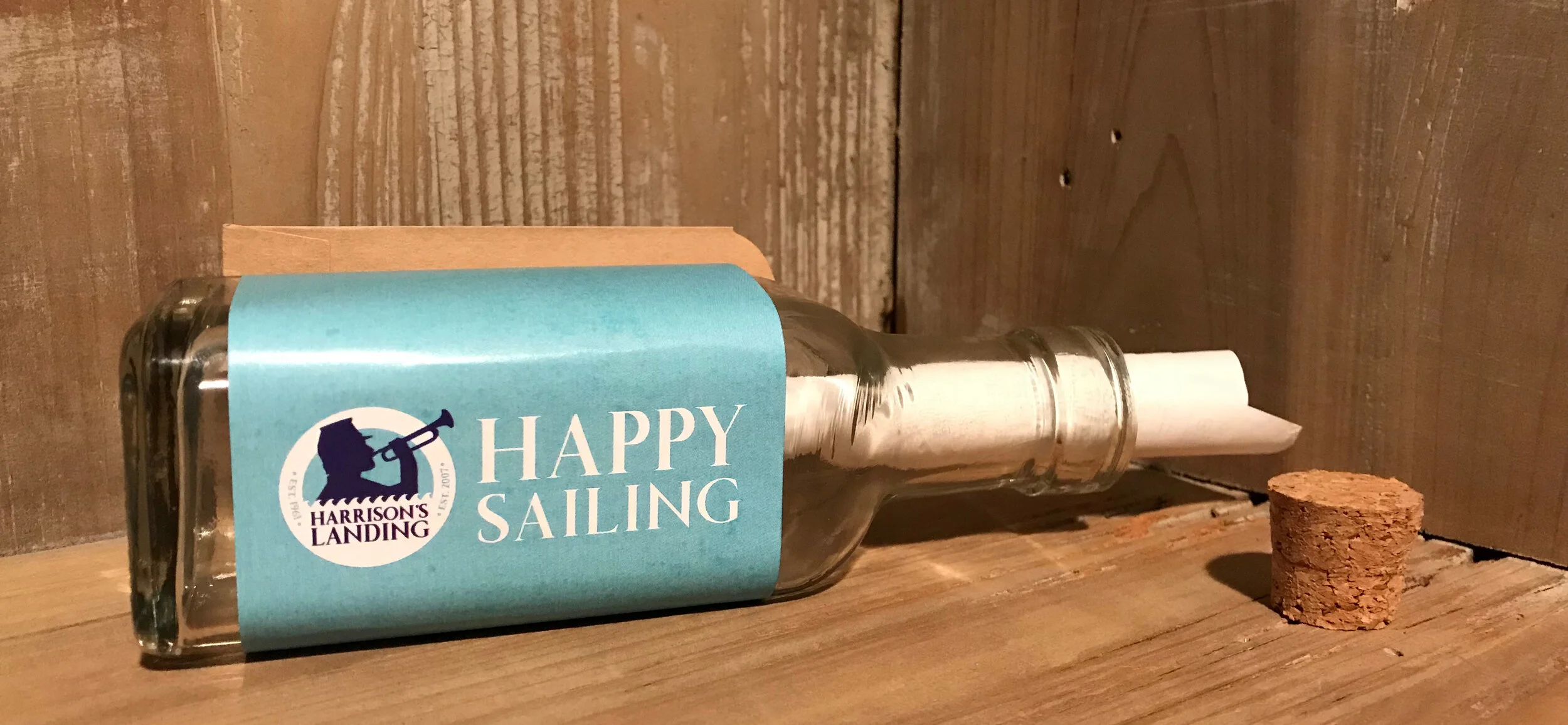
My solution proved to be successful as I pitched it to a panel of judges upon completion. One of these judges happened to be the son of the owners of Harrison’s Landing. He gave overall praise of the design especially the message in a bottle receipt idea. There was feedback about edits to some of the type and illustrations to pull back on the elegant touches but overall, the design was appropriate for the defined audience.
From this project I learned a lot about the process of taking hand drawn illustrations into Adobe Illustrator and how to work with heavy patterns. It is was also difficult to develop as diverse patterns for the tavern and dessert menu as I did for the main menu, so this was one project that really introduced me to looking at the whole campaign of branding instead of just one single item.
Also, as my first experience setting a large amount of type within a limited amount of space, I learned a lot about typesetting and the mechanics of making a lot of information still feel breathable.

